Building a Road to Suwannee County
With an established track record of marketing within the Travel and tourism industry for over 34 years, BlackDog Advertising was selected to create a brand identity expressing the essence of Suwannee County and its people, while also building brand recognition through a distinct logo that would stand out among other Florida travel destinations.
Initial Brand Strategy Research
Wanting to build upon Suwannee County’s many strengths, our team created a brand storyboard that featured the attributes that set Suwannee County apart from the competition that would influence people to visit this great destination. Among these is the famous Suwannee River itself, an enduring symbol of tradition and the inspiration behind the Florida State Song, and all that which draws strength from it like the many natural springs, caves and trails that make Suwannee County a preferred location for lovers of the outdoors. Another aspect we wanted to emphasize was Suwannee County’s rustic appeal, a place that harkens back to a simpler time, absent of the trappings of big city life, that moves to the rhythms of the great Suwannee River itself.
Swimming Upstream
There was, however, a sizable obstacle in our way that needed to be overcome. We were going head-to-head with all the branding and messaging already flooding the Florida Tourism Market with no branding of our own and little else to help us stand out in the crowd.
Bringing People Together... Naturally

The findings from our initial market analysis showed that Suwannee County visitors were a broad, diverse range of individuals that included 55+ RV travelers passing through to the 20 somethings that flocked to the many music events that take place at the Suwannee Music Park. Not only was it important to continue to stay connected to these groups but we also identified experiential travelers, eco-tourists, families and Millennials looking for authentic, offline experiences as a great opportunity to expand and diversify the visitorship of the county.
Taking all these things into consideration, we developed a robust destination marketing solution that included custom iconography, custom typography and a unique tagline that would unify the marketing message moving forward.
The Logo: A Brand's Brand
Iconography
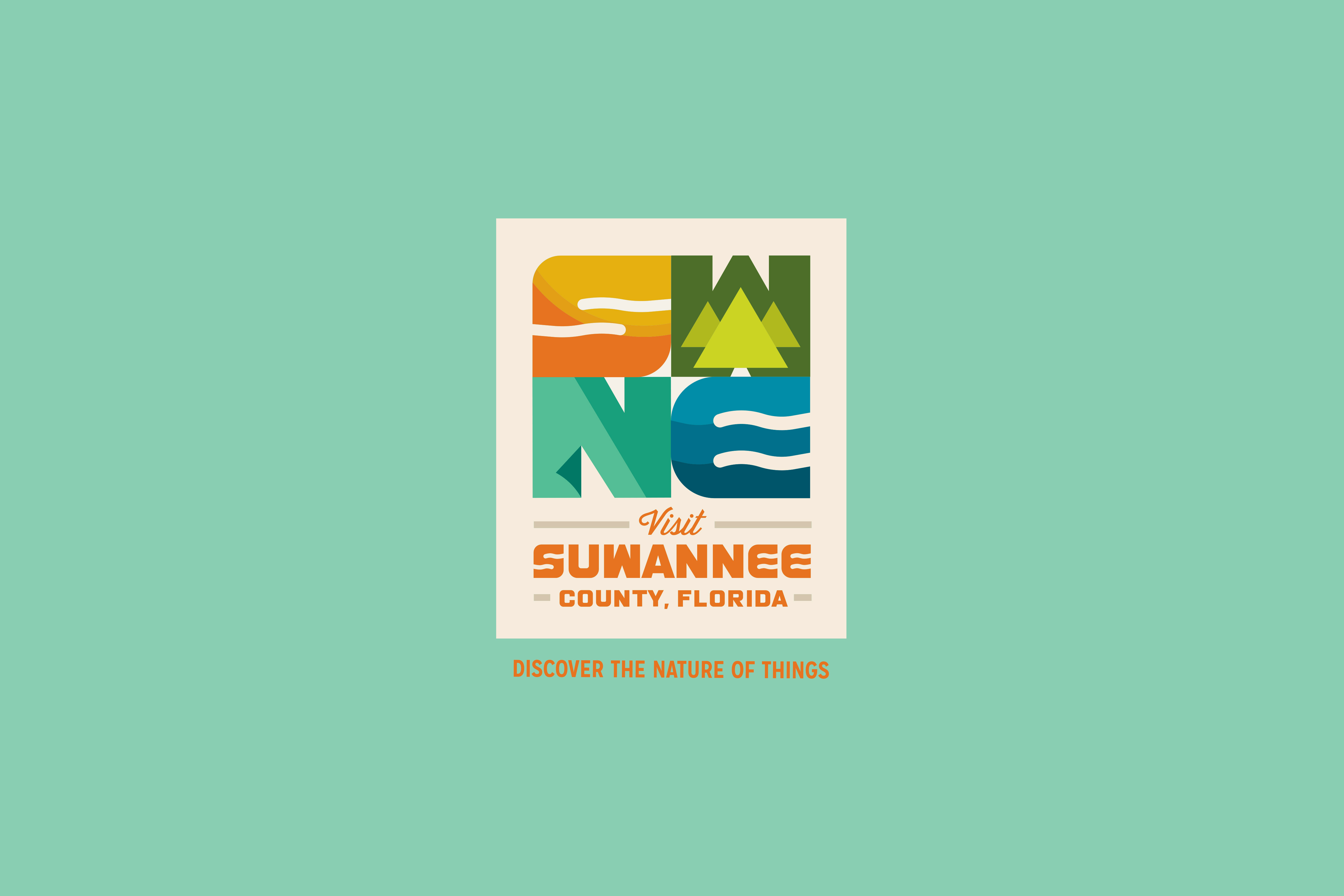
The challenge was to create a visual manifestation that incorporated everything we had learned about Suwannee County and the insights and opinions of its community. This was the creative direction we pursued:
- Appealing graphic elements
- Warm and inviting color palette
- Organically shaped lettering
- Subtle cues within the lettering that visually represent the best of Suwannee County
- Abbreviated to form an acronym for more impact
- Flat, contemporary design aesthetic
- The letters S-W-N-E signify the four cardinal directions found on a compass and subtly drive home an overall sense of exploration
Typography
The typeface that was created, while bold, also exudes a casual, welcoming energy. It makes a promise to the viewer that Suwannee County is a place that believes in fun and is well worth a visit. Incidentally, having a strong call to action (CTA) with the inclusion of the word “Visit”, allows us to further reinforce that sentiment.
Tagline: Discover the Nature of Things
As in any tagline, the goal is to make a statement that best articulates the essence of a particular brand, often in no more than a line of copy. In this case, it also functions as a secondary call to action (CTA) encouraging the viewer to discover Suwannee County through its exceptional natural resources. The tagline’s double meaning speaks not only to discovering the nature that surrounds Suwannee County, but on a deeper level, it encourages the reader to gain an understanding of the area’s people, its history and folkways.
The Same Great Song Sung Many Ways
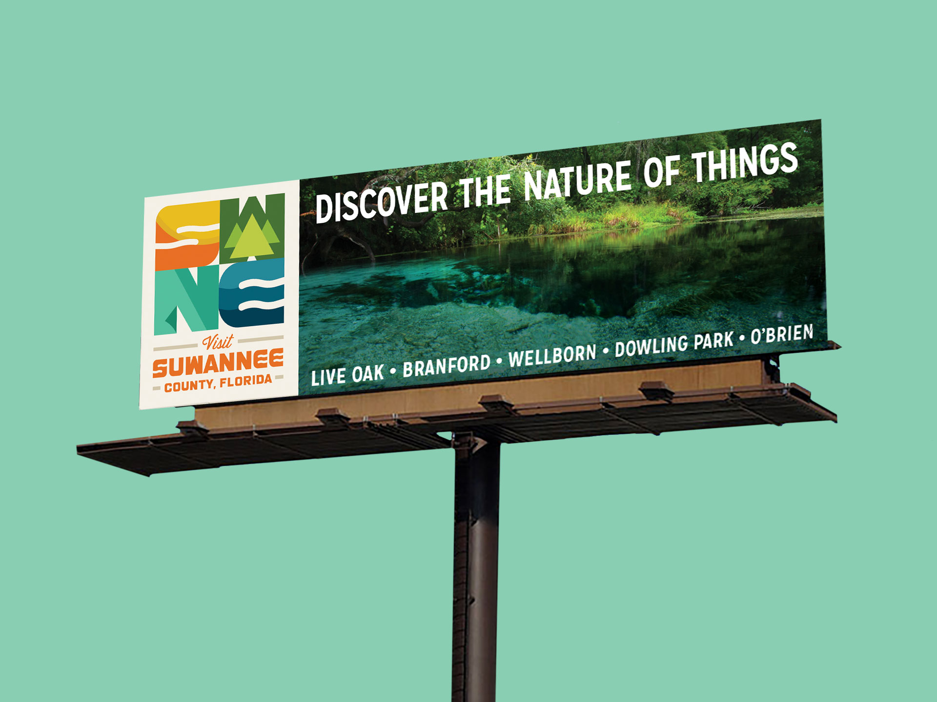
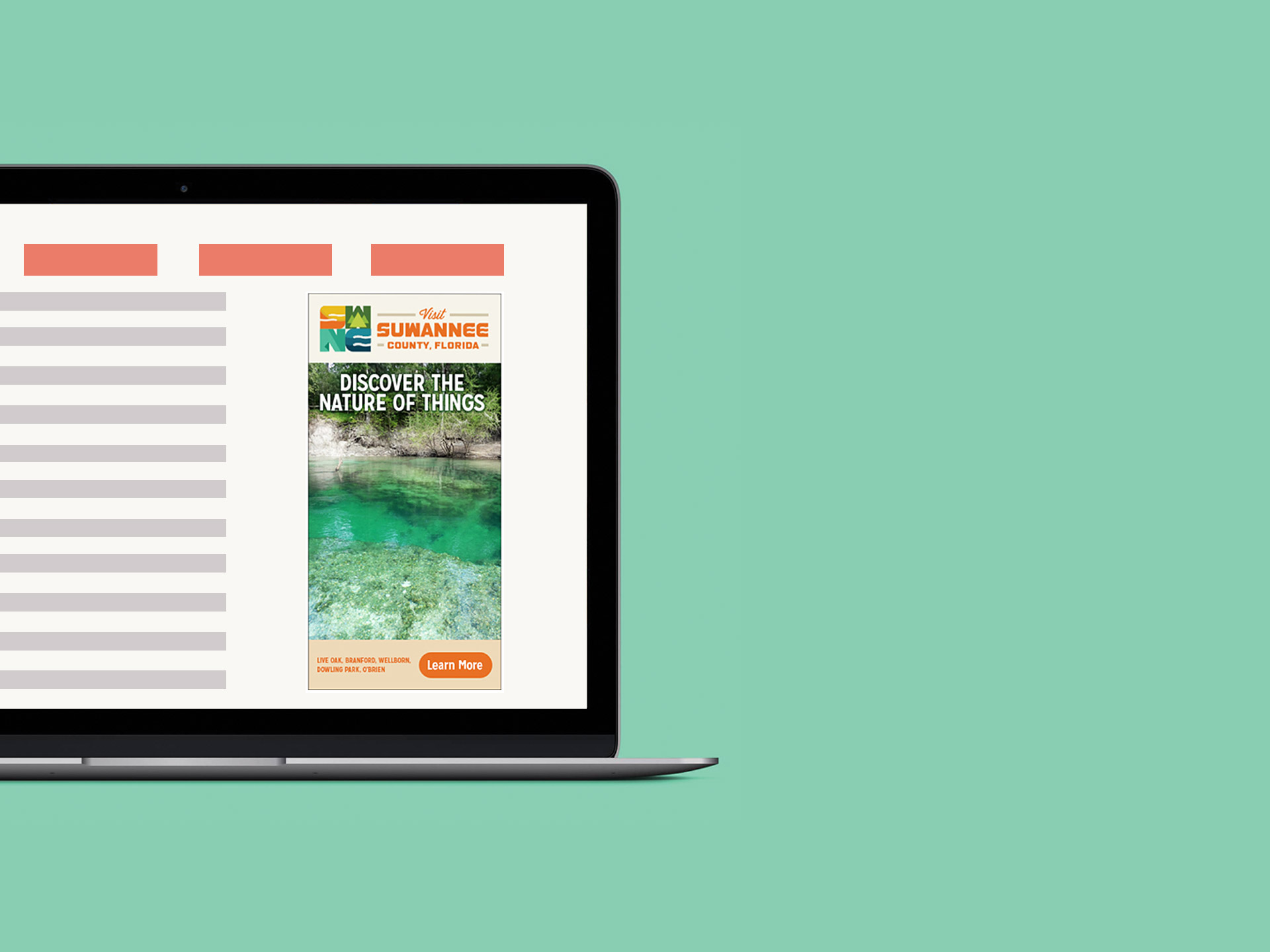
With all brand solutions, there are ways to represent the brand based on the space in which it exists, be it in the digital or offline worlds. As long as the look & feel, fonts and color palette are consistent, the brand identity will have continuity across all marketing platforms.
- Consistency in visual elements
- Ability to stand alone
- Flexibility across marketing platforms
- Continuity with branding
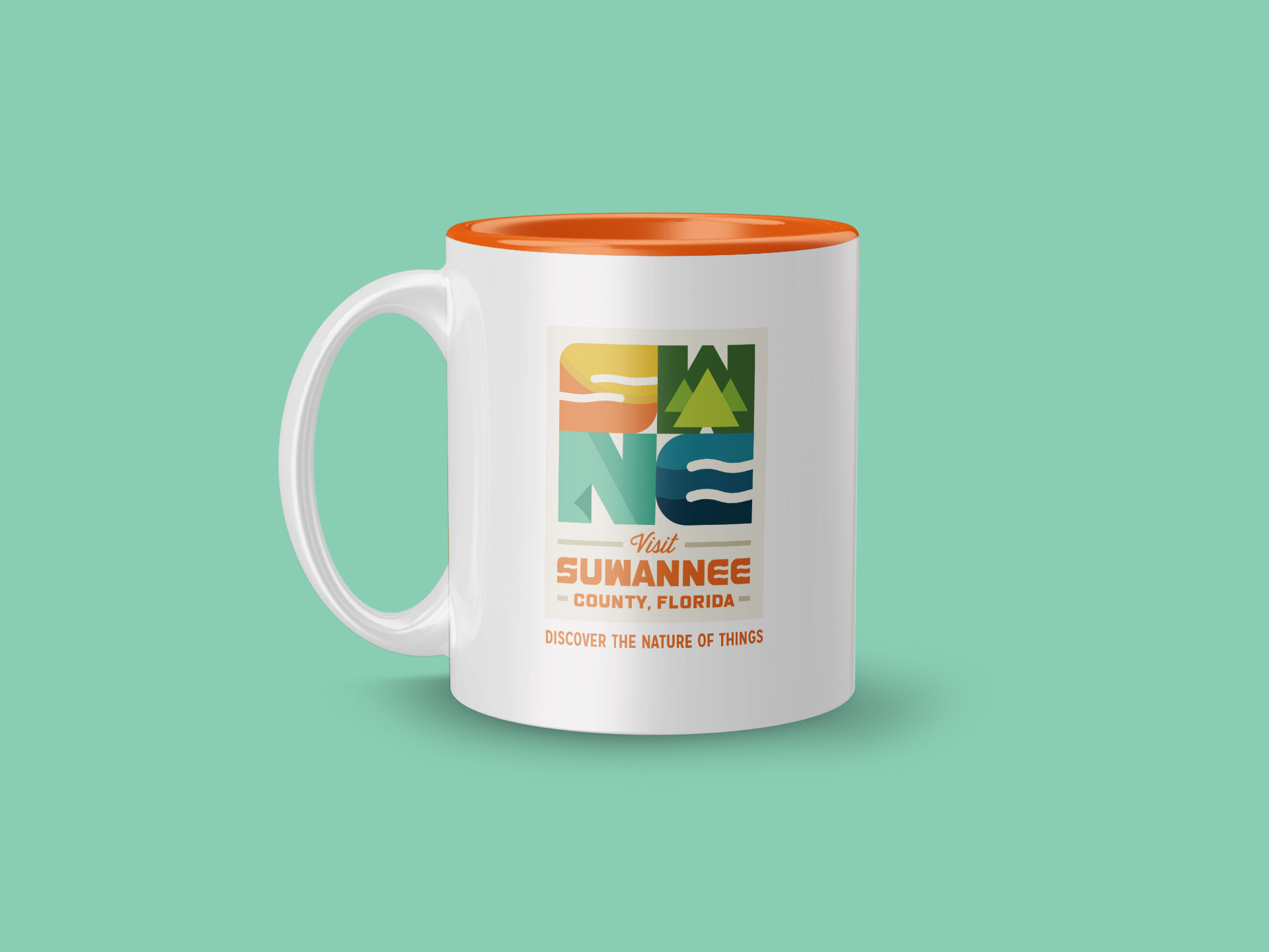
- Easily adaptable for retail/merchandising applications
Like a River, a Great Logo Bends But Never Breaks
One of the components of a strong brand identity is if your logo can work when broken up into stand alone elements. The design should be flexible enough to be able to do its job regardless of the environment it is placed in. Every logo needs to be created to work in many formats, whether it’s a stacked or horizontal solution or simply if the typography is by itself. Once a brand is established within brand awareness initiatives, the iconography will become a distinctive element easily identifiable as a representation of the entire brand.
